


August 2020
Most CSS frameworks have support for responsive tables … but what does responsive even mean in this context?
When screens get small, these frameworks will either squish the data, or add a horizontal scroll.
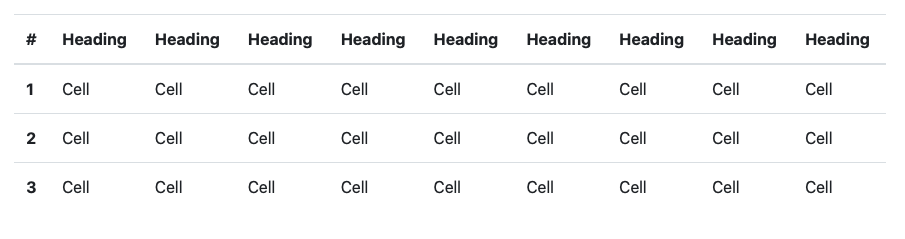
So a table that looks like this on a desktop:
will look like this on mobile:
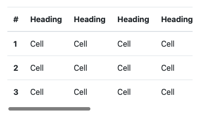
Note the data is cut off, and scrollbar is added.
Is there an alternative way to handle this scenario? Let’s try to invert a table on its side when screens get small.
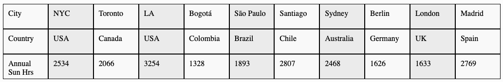
We have a table of sunshine hours by city:
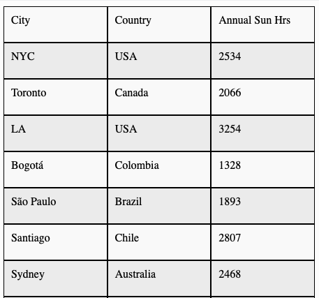
On mobile, let’s invert the data 90 degrees:
Good news - all that’s required is a bit of flex box - here’s a demo:
See the Pen Inverting Tables by e b (@eb23) on CodePen.
HTML:
<table>
  <tbody>
    <tr>
      <th>City</th>
      <th>Country</th>
      <th>Annual Sun Hrs</th>
    </tr>
    <tr>
      <td>NYC</td>
      <td>USA</td>
      <td>2534</td>
    </tr>
            ...
    <tr>
      <td>Madrid</td>
      <td>Spain</td>
      <td>2769</td>
    </tr>
  </tbody>
</table>
CSS:
table{
  width:100%;
}
tbody{
  display:flex;
  flex-direction: row;
  width: 100%;
}
tr{
  flex: 1;
  display: block;
}
td{
  display:block;
}

@media only screen and (max-width: 600px) {
  tbody{
    flex-direction: column;
  }
  tr{
    display:flex;
    flex-direction: row;
  }
  td, th{
    flex: 1;
  }
}
We accomplish with just a few lines of flexbox. For mobile, we switch the flex-direction, and also make sure the tr elements are flex.
Note that we could have omitted flex-direction: row in both instances as that’s the default value.